Opposites Attract
HOW CONTRASTING COLORS CREATE A VIVID PALETTE
Have you taken the first step and dipped your toe in the baby pool of color, only to find that everything else now looks drab and tired? Okay, it’s time to walk towards the middle of the pool and stretch those floatie covered arms out into the big kids’ pool by adding a contrasting color. When I was in grade school, we learned that contrasting colors could be remembered by thinking of holidays: red and green are Christmas colors, purple and yellow are Easter colors, and orange and blue – well, they are “sort of” Halloween colors – if you stretch the blue to black. If you look at a color wheel, you’ll see that these colors fall opposite of each other. The fun facts about contrasting colors are:
1) They can make each other vibrate if placed next to each other in the same saturation
2) They can make grey if you mix them together
3) They bring out the intensity in each other when used together
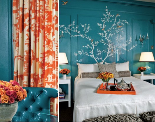
Fun fact number 3 is the thing we’re going to focus on – so here are a few combinations of contrasting colors that, when paired with neutrals like grey, cream, white, or chocolate browns can really create a strong design statement.
Fuschia and apple green
Turquoise and Burnt Orange
Marigold and Cobalt
Take a chance and you’ll make a splash! (Sorry, I couldn’t resist!)